JSF message Tag
In this section we will explain you JSF message tag. This is used to display the most recent message for the component. This is used to show the message for a particular component. This tag shows the message for the component specified in for attribute of message tag. If you want to customize the message then CSS can be used. If you want to show the error message for a component in a color and other information in different color then CSS can be helpful.
Code Description :
| <%@ taglib uri="http://java.sun.com/jsf/core" prefix="f" %> <%@ taglib uri="http://java.sun.com/jsf/html" prefix="h" %> <f:view> <html> <body> <h:form>Enter text in this box :<br> <h:inputText id="input_text" value="#{MessageBean.a}" required="true"/> <h:message for="input_text" /><br> <h:commandButton action="Submit" value="Submit"/> </h:form> </body> </html> </f:view> |
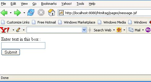
Rendered Output :

If this input text field is not filled by the user and submit is pressed then the error message is flashed for this component to warn that this is the required field to be filled. It shows that it can't be left blank because "required" field is set to "true" for the input field. The message tag shows the error message related to this component because its "for" attribute is set to the id for this input text field. So if this field is left blank before submitting the page, then the output comes as below :

Html Source Code :
|
This tag has some attributes that can be used for different purpose. These attributes are described below :
- id : It is the component identifier that must be unique in the closest container.
- binding : It takes the value binding expression that is used to link the component to the property of the backing bean.
- rendered : Its a boolean attribute. It determines whether this component should be rendered or not.
- for : This is the required attribute for the component. It takes the id for a component. message tag displays the message for this component whose id has been specified in for attribute.
- showSummary : Its a boolean flag. Its default value is true. It is used to determine whether the summary part of the message should be included or not.
- showDetail :Its a boolean flag. Its default value is true. It is used to determine whether the detail part of the message should be included or not.
- dir : It is used to set the direction of the text to be displayed. It can take two values LTR(left to right) and RTL (right to left).
- lang : It is used to set the base language of the component when displayed.
- style : It is used to set the CSS style definition for the component.
- title : It is the standard html attribute.It is used to set the tooltip text for this component.
- styleClass : It is used to set the CSS class for the component.
- onclick : Script to be invoked when the element is clicked.
- ondblclick : It is used for Java Script code to be invoked when the element is double-clicked.
- onmousedown : It is used for Java Script code to be invoked when the pointing device is pressed over this element.
- onmouseup : It is used for Java Script code to be invoked when the pointing device is released over this element.
- onmouseover : It is used for Java Script code to be invoked when the pointing device is moved into this element.
- onmousemove : It is used for Java Script code to be invoked when the pointing device is moved while it is in this element.
- onmouseout : It is used for Java Script code to be invoked when the pointing device is moves out of this element.
- onkeypress : It is used for Java Script code to be invoked when a key is pressed over this element.
- onkeydown : It is used for Java Script code to be invoked when a key is pressed down over this element.
- onkeyup : It is used for Java Script code to be invoked when a key is released over this element.
- infoClass : This is to determine the CSS class to be applied to information message.
- infoStyle : This is to determine the CSS style to be applied to information message.
- warnClass : This is to determine the CSS class to be applied for warning message.
- warnStyle : This is to determine the CSS style to be applied for warning message.
- errorClass : This is to determine the CSS class to be applied to error message.
- errorStyle : This is to determine the CSS style to be applied to error message.
- fatalClass : This is to determine the CSS class to be applied to fatal message.
- fatalStyle : This is to determine the CSS style to be applied to fatal message.
- tooltip : It is a boolean attribute. It is used to determine whether to show the summary message in a tooltip or not.
