
JSF inputSecret Tag
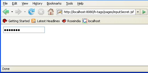
This section illustrates you more about the JSF HTML inputSecret tag. This tag is used to create a text box for having password that is secret. This text box shows only a symbol for every enteries. You can't understand the value of the text box by seeing.
Here, you will see in the program code that the value of the inputSecret tag has been assigned "chandan" but by seeing it's output as given below, any one can't understand. This type of text box helps you to keep your data secret.
Code Description:
<%@ page contentType="text/html"
%> |
Rendered Output:
HTML Source Code:
Following is the html code generated by the browser when your JSF program is run.
<html> <head><title>jsf h:message example</title></head> <body> <input type="password" name="_id0" value="" /> </body> </html> |
All attributes of the inputSecret tag are explained as follows:
-
accesskey: This is standard html attribute. It is used to set the access key for the element which is used to send the focus to the element when pressed.
-
alt: This is used as an alternate text that is displayed when browser is not able to display the element.
-
binding: It takes the value binding expression that is used to link the component to the property of the backing bean.
-
converter: This specifies the converter for the component. This can be static value or EL expression.
-
dir: It is used to set the direction of the text to be displayed. It can take two values LTR(left to right) and RTL (right to left).
-
disabled: Its a boolean attribute. This is used to disable the element to receive focus, when it is set to true.
-
id: This attribute is used to uniquely identify the element within the closest container.
-
immediate: Its a boolean attribute. It is used to identify during which phase value change event should occur. If this attribute is set to true then in place of firing the event during the process validation phase, these event are sent immadiately at the end of apply request values phase.
-
lang: It is used to set the base language of the component when displayed.
-
maxlength: It is used to set the maximum length of character that can be input into the text field.
-
onblur: It is used to set the java script code to execute when focus is lost from the element.
-
onchange: It is used to set the java script code to execute when element is modified.
-
onclick: Script to be invoked when the element is clicked.
-
ondblclick: It is used for Java Script code to be invoked when the element is double-clicked.
-
onfocus: It is used to set the java script code to execute when element receives the focus.
-
onkeydown: It is used for Java Script code to be invoked when a key is pressed down over this element.
-
onkeypress: It is used for Java Script code to be invoked when a key is pressed over this element.
-
onkeyup: It is used for Java Script code to be invoked when a key is released over this element.
-
onmousedown: It is used for Java Script code to be invoked when the pointing device is pressed over this element.
-
onmousemove: It is used for Java Script code to be invoked when the pointing device is moved while it is in this element.
-
onmouseout: It is used for Java Script code to be invoked when the pointing device is moves out of this element. 0
-
onmouseover: It is used for Java Script code to be invoked when the pointing device is moved into this element.
-
onmouseup: It is used for Java Script code to be invoked when the pointing device is released over this element.
-
onselect: It is used to set the java script code to execute when text of the component is selected by the user. 1
-
readonly: Its a boolean attribute. It is used to indicate the user that its value can't be modified, if it is set to true.
-
redisplay: This is a boolean attribute. This is used to specify that the password, that have been entered previously, has to be rendered again or not. Its default value is "false" because we generally need not to do this for security reasons.
-
rendered: Its a boolean attribute. Its default value is true. It determines whether this component should be rendered or not. 2
-
required: Its a boolean attribute. It indicates that its value is required by the user before the submission of the form to the server. If it is set to true and value is not provided then an error message comes.
-
size: It is used to set the width (in character) of the component.
-
style: It is used to set the CSS style definition for the component. 3
-
styleClass: It is used to set the CSS class for the component.
-
tabindex: This is a standard html attribute. It is used to set the order of receiving the focus on the movement of TAB key by the user.
-
title: It is the standard html attribute. It is used to set the tooltip text for this component. 4
-
validator: It takes the method binding expression. This expression represents the validator method. This method is called at the time of validation of the component.
-
value: This is to set the current value of the component.
-
valueChangeListener: This also takes a method binding expression. This expression represents value change listener method. This method will be called when new value is set for this component. 5