
EXAMPLES EXPLORED
(Part-2) (published in July-05)
In this second part of the author shows how we can create our own components based on the model for,
- Chart
- Menu
- Tree
- Tabbed-pane
provided by SUN documentation in JSF.
1.Chart:
The Chart can be drawn by using the tag
Vertical bar chart is default. The horizontal bar chart is drawn by setting the orientation attribute of <d:chart> tag as horizontal. The pie chart is drawn by setting the type attribute of <d:chart> tag as 'pie'. The other attributes of <d:chart> tag are width, height to set the width and height of the graph and xlabel, ylabel to set the X-Coordinates and Y-Coordinates respectively. The pie doesn't take x and ylabel attributes.
The various elements of the chart are specified by using the tag <d:chartItem>. The attributes of <d:chartItem> are itemLabel to specify a unique name to each element, itemValue to specify the value of various elements, itemColor to specify the color of a particular element. This is same for all the three types of charts.

Fig. SCREENSHOT-7 (Chart)
****************************************
//f:\tomcat5\webapps\jsf-components\
chart1.jsp
<%@ taglib prefix="f" uri="http://java.sun.com/jsf/core" %>
<%@ taglib prefix="h" uri="http://java.sun.com/jsf/html" %>
<%@ taglib prefix="d" uri="http://java.sun.com/jsf/demo/ components" %>
<!DOCTYPE HTML PUBLIC "-//W3C//DTD HTML 4.01 Transitional//EN">
<f:view>
<html>
<body>
<h:form>
<h:outputText value="Vertical Bar
Chart with data specified via JSP" />
<br>
<d:chart width="300" height="300"
title="Vertical Bar Chart"
xlabel="X-Coordinates"
ylabel="Y-Coordinates">
<d:chartItem itemLabel="item1"
itemValue="200" itemColor="red" />
<d:chartItem itemLabel="item2"
itemValue="400" itemColor="green"/>
<d:chartItem itemLabel="item3"
itemValue="250" itemColor="blue"/>
</d:chart> <br><br>
<h:outputText value="Horizontal Bar
Chart with data specified via JSP" />
<br>
<d:chart width="300" height="300"
type="bar" orientation="horizontal"
title="Horizontal Bar Chart"
xlabel="X-Coordinates"
ylabel="Y-Coordinates">
<d:chartItem itemLabel="item1"
itemValue="200" itemColor="red" />
<d:chartItem itemLabel="item2"
itemValue="400" itemColor="green"/>
<d:chartItem itemLabel="item3"
itemValue="250" itemColor="blue" />
<d:chartItem itemLabel="item4"
itemValue="350" itemColor="cyan" />
<d:chartItem itemLabel="item5"
itemValue="300" itemColor="orange"/>
</d:chart> <br><br>
<h:outputText value="Pie Chart with data
specified via JSP" />
<br>
<d:chart width="400" height="200"
type="pie" title="Pie Chart">
<d:chartItem itemLabel="item1"
itemValue="200" itemColor="red" />
<d:chartItem itemLabel="item2"
itemValue="400" itemColor="green"/>
<d:chartItem itemLabel="item3"
itemValue="600" itemColor="blue"/>
<d:chartItem itemLabel="item4"
itemValue="800" itemColor="cyan"/>
</d:chart> </td>
</h:form>
</body>
</html>
</f:view>
----------------------------------------
Now start the Tomcat5 with JAVA_HOME=
g:\jdk1.5 . Open browser and type the URL as
http://localhost:8080/jsf-components/ faces/chart1.jsp
We will get colored charts.
--------------------------------------------
2. Menu and Tree:
In order to place the menu, first a menubar is placed by using the tag <d:graph_menubar> and its attributes are set. The attribute ?selectedClass? is set as ?tree-control-selected?, and the attribute ?unselectedClass? is set as ?tree-control-unselected? and the attribute immediate is set as ?true?.
Any number of menunodes are added in the menubar by using the tag <d:graph_menunode>. The various attributes of <d:graph_menunode> name, label etc., are set. When the node is to be expanded expanded is set as ?true?. The enabled attribute is set as ?false? when there is no action event for that node.
In order to place the tree the tag <d:graph_menutree> is used and its attributes are set. The attribute 'styleClass' is set as 'tree-control'. The attribute 'selectedClass' is set as ?tree-control-selected?, and the attribute ?unselectedClass? is set as ?tree-control-unselected? and the attribute ?immediate? is set as 'true'.
The nodes are added to the tree by by using the tag <d:graph_treenode>. The various attributes of <d:graph_treenode> name, label etc., are set. When the node is to be expanded 'expanded' is set as 'true'. The enabled attribute is set as 'false' when there is no action event for that node. The icon "folder_16_pad.gif" is placed for each tree nodes. This icon is present in the images folder of the jsf-components.
For menus and trees, the font size, font color of the selected and unselected nodes, line height etc. depends on the value set for the attributes (selectedClass and unselectedClass) 'tree-control-selected' and 'tree-control-unselected'. We can change it by altering the entries in the file tree-control-test.css present in f:\tomcat5\webapps\jsf-components. No need to make any entries in the file. The default values will be present there.

Fig. SCREENSHOT-8 (Menu and Tree)
//f:\tomcat5\webapps\jsf-components\
menu1.jsp
<%@ taglib prefix="f" uri="http://java.sun.com/jsf/core" %>
<%@ taglib prefix="h" uri="http://java.sun.com/jsf/html" %>
<%@ taglib prefix="d" uri="http://java.sun.com/jsf/demo/
components" %>
<f:view>
<html>
<body bgcolor="white">
<h:form >
<d:stylesheet
path="/tree-control-test.css"/>
<hr> Render graph as a menu bar (graph specified via JSP):<br>
<d:graph_menubar id="menu3"
selectedClass="tree-control-selected"
unselectedClass="tree-control-
unselected" immediate="true">
<d:graph_menunode name="Menu"
label="Menu" >
<d:graph_menunode name="Menu1"
label="Menu1" expanded="true">
<d:graph_menunode name="Item1"
label="Item1" enabled="false" />
<d:graph_menunode name="Item2"
label="Item2" enabled="false" />
</d:graph_menunode>
<d:graph_menunode name="Menu2"
label="Menu2" >
<d:graph_menunode name="Item1"
label="Item1" enabled="false"/>
<d:graph_menunode name="Item2"
label="Item2" enabled="false" />
</d:graph_menunode>
</d:graph_menunode>
</d:graph_menubar>
<hr>
Render graph as a tree control (graph specified via JSP):<br>
<d:graph_menutree id="menu5"
selectedClass="tree-control-selected"
unselectedClass="tree-control-
unselected" immediate="true"
styleClass="tree-control" >
<d:graph_treenode name="Menu"
label="Menu" enabled="false"
expanded="true">
<d:graph_treenode name="Menu1"
label="Menu1" enabled="false"
icon="folder_16_pad.gif" >
<d:graph_treenode name="Item1"
label="Item1" enabled="false"
icon="folder_16_pad.gif" />
<d:graph_treenode name="Item2"
label="Item2" enabled="false"
icon="folder_16_pad.gif" />
</d:graph_treenode>
<d:graph_treenode name="Menu2"
label="Menu2" expanded="true"
icon="folder_16_pad.gif"
enabled="false">
<d:graph_treenode name="Item3"
label="Item3" enabled="false"
icon="folder_16_pad.gif" />
<d:graph_treenode name="Item4"
label="Item4" enabled="false"
icon="folder_16_pad.gif" />
</d:graph_treenode>
</d:graph_treenode>
</d:graph_menutree>
<hr>
</h:form>
</body>
</html>
</f:view>
-----------------------------------------
Open browser and type the URL as http://localhost:8080/jsf-components/ faces/menu1.jsp We will get colored menus and trees. No need to restart tomcat server as nothing is added to the classes folder.
3. Tabbed pane:
The tabbed pane component is added by using the tag <d:pane_tabbed> and the attribute are set. The attributes ?paneClass? is set as ?tabbed-pane?, ?contentClass? is set as ?tabbed-content?, ?selectedClass? is set as ?tabbed-selected? and ?unselectedClass? is set as ?tabbed-unselected?
The function of the various JSP Attributes of tag <d:pane_tabbed> are
a) paneClass:- A style sheet class which controls the display attributes of the outer border and tabs of the control.
b) contentClass: A style sheet class which controls the display attributes of the selected child pane contents.
c) selectedClass: A style sheet class which controls the display attributes of the select tab label. This is used to distinguish the selected tab from the other unselected tabs.
d) unselectedClass: A style sheet class which controls the display attributes of an unselected tab label. This is used to distinguish an unselected tab from a selected tab.
The tabbed panes are added by using the tag <d:pane_tab> and its attribute ?id? is set. The tab <d:pane_tablabel> is used to give a label to each pane. When we the label, corresponding pane becomes active. The controls are added into each pane by using the tag <h:panelGroup>The background-color, border, font-size, font-family, font-weight, text-alignment, text-color, padding, width and the color of the selected and unselected tabbed pane depends on the value set for the attributes (selectedClass and unselectedClass) ?tabbed-selected? and ?tabbed-unselected?. We can change it by altering the entries in the file stylesheet.css present in f:\tomcat5\webapps\jsf-components. No need to make any entries in the file. The default values will be present there. 0
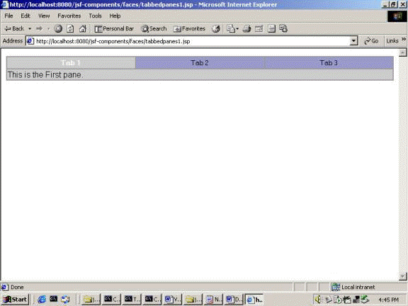
Fig. SCREENSHOT-9(Tabbed Pan)
//f:\tomcat5\webapps\jsf-components\
tabbedpane1.jsp
<%@ taglib prefix="f" uri="http://java.sun.com/jsf/core" %>
<%@ taglib prefix="h" uri="http://java.sun.com/jsf/html" %>
<%@ taglib prefix="d" uri="http://java.sun.com/jsf/demo/
components" %>
<f:view>
<html>
<body bgcolor="white">
<h:form>
<d:stylesheet path="/stylesheet.css"/>
<d:pane_tabbed id="tabcontrol"
paneClass="tabbed-pane"
contentClass="tabbed-content"
selectedClass="tabbed-selected"
unselectedClass="tabbed-unselected">
<d:pane_tab id="first">
<f:facet name="label">
<d:pane_tablabel label="Tab 1"
commandName="first" />
</f:facet>
<h:panelGroup>
<h:outputText value="This is the
First pane. " />
</h:panelGroup>
</d:pane_tab>
<d:pane_tab id="second">
<f:facet name="label">
<d:pane_tablabel label="Tab 2"
commandName="second"/>
</f:facet>
<h:panelGroup>
<h:outputText value="This is the
Second pane. " />
</h:panelGroup>
</d:pane_tab>
<d:pane_tab id="third">
<f:facet name="label">
<d:pane_tablabel label="Tab 3"
commandName="third"/>
</f:facet>
<h:panelGroup>
<h:outputText value="This is the
Third pane. " />
</h:panelGroup>
</d:pane_tab>
</d:pane_tabbed>
</h:form>
</body>
</html>
</f:view>
----------------------------------------- 1
Open browser and type the URL as http://localhost:8080/jsf-components/ faces/tabbedpane1.jsp
We will get three tabbed panes. When we click on the label ?Tab 2?, second tabbed pane gets activated.
This completes our two part tutorial on JSF 2
 JSF Home