
Tomahawk inputFileUpload tag
File uploading is the concept of uploading the file to the server. The component for this purpose is created using <t:inputFileUpload> tag. Do remember to include "enctype" attribute in the form tag and set to "multipart/form-data". You must enable the MultiPart Filter to make the component work. For this you have to add the code below in the web.xml file.
<filter>
<filter-name>extensionsFilter</filter-name>
 <filter-class>org.apache.myfaces.webapp.filter.ExtensionsFilter
  </filter-class>
    <init-param>
      <description>Set the size limit for uploaded files.
            Format: 10 - 10 bytes
            10k - 10 KB
            10m - 10 MB
            1g - 1 GB
        </description>
      <param-name>uploadMaxFileSize</param-name>
      <param-value>100m</param-value>
      </init-param>
      <init-param>
         <description>Set the threshold size - files below this
             limit are stored in memory, files above this limit
             are stored on disk.
                         Format: 10 - 10 bytes
                         10k - 10 KB
                         10m - 10 MB
                         1g - 1 GB
         </description>
         <param-name>uploadThresholdSize</param-name>
         <param-value>100k</param-value>
         </init-param>
</filter>

<filter-mapping>
         <filter-name>extensionsFilter</filter-name>
         <url-pattern>*.jsf</url-pattern>
</filter-mapping>

<filter-mapping>
          <filter-name>extensionsFilter</filter-name>
          <url-pattern>/faces/*</url-pattern>
</filter-mapping>
|
Code Description : In this code we have used inputFileUpload tag to create this file upload component. We have also created a button that when clicked, causes a method upload() of the backing bean(FileUploadForm.java) to be called. In this code, the output text for showing success and failure is rendered based on the condition of success / failure in uploading the file. For this rendered attribute has been used.
<%@taglib uri="http://java.sun.com/jsf/html" prefix="h"%>
<%@taglib uri="http://java.sun.com/jsf/core" prefix="f"%>
<%@ taglib uri="http://myfaces.apache.org/tomahawk"
  prefix="t" %>
<html>
<head>
<title>t:inputFileUpload example</title>
</head>
<body>
<f:view>
  <h:form id="welcomeForm" enctype="multipart/form-data">
    <t:inputFileUpload id="fileupload" value=
"#{FileUploadForm.upFile}" size="20" /><p/>
    <h:commandButton value="Load the file" action=
"#{FileUploadForm.upload}" />
    <t:outputText value="File Uploaded Successfully."
		rendered="#{FileUploadForm.rendSuccess}"
		style="color:green;font-weight:bold"/>
    <t:outputText value="Error in File Uploading."
		rendered="#{FileUploadForm.rendFailure}"
		style="color:red;font-weight:bold"/>
  </h:form>
</f:view>
</body>
</html>
|
FileUploadForm.java :
package net.roseindia.web.ui;
|
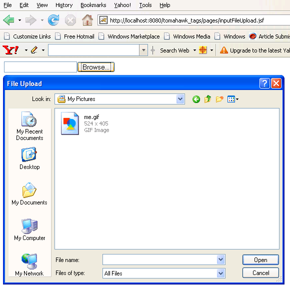
Rendered Output : This is the output of the above code. The file upload component is the combination of an input box and a button for choosing a file to be uploaded.

Click the browse button and select one file to upload it.
The following figure appears when a file is successfully uploaded.

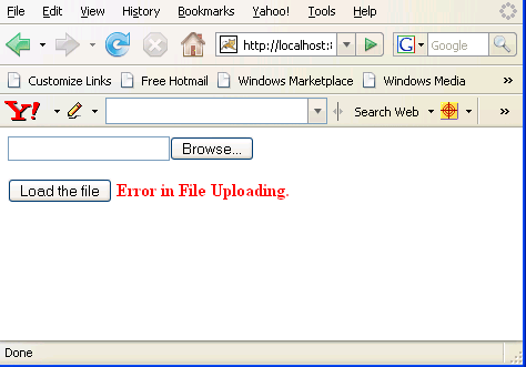
The following figure appears when there is any problem in uploading a chosen file.
Html Source Code :
<html>
<head>
<title>t:inputFileUpload example</title>
</head>
<body>
<form id="welcomeForm" name="welcomeForm" method="post"
	action="/tomahawk_tags/pages/inputFileUpload.jsf"
	enctype="multipart/form-data">
<input type="file" id="welcomeForm:fileupload"
	name="welcomeForm:fileupload" size="20" /><p/>
<input id="welcomeForm:_idJsp0" name="welcomeForm:_idJsp0"
	type="submit" value="Load the file"
	onclick="if(typeof window.clearFormHiddenParams_
	welcomeForm!='undefined'){clearFormHiddenParams_
	welcomeForm('welcomeForm');}" />
<input type="hidden" name="welcomeForm_SUBMIT" value="1" />
<input type="hidden" name="welcomeForm:_idcl" />
<input type="hidden" name="welcomeForm:_link_hidden_" />
<script type="text/javascript"><!--
	function clear_welcomeForm()
	{
	   clearFormHiddenParams_welcomeForm('welcomeForm');
	}

     function clearFormHiddenParams_welcomeForm(currFormName)
	{
	   var f = document.forms['welcomeForm'];
	   f.elements['welcomeForm:_idcl'].value='';
	   f.elements['welcomeForm:_link_hidden_'].value='';
	   f.target='';
	}
	clearFormHiddenParams_welcomeForm();
//--></script><input type="hidden" name=
"javax.faces.ViewState" id="javax.faces.ViewState"
value="rO0ABXVyABNbTGphdmEubGFuZy5PYmplY3Q7kM5YnxBzKWwCAAB4cAA
AAANzcgBHb3JnLmFwYWNoZS5teWZhY2VzLmFwcGxpY2F0aW9uLlRyZWVTdHJ1Y
3R1cmVNYW5hZ2VyJFRyZWVTdHJ1Y3RDb21wb25lbnRGWRfYnEr2zwIABFsACV9
jaGlsZHJlbnQASltMb3JnL2FwYWNoZS9teWZhY2VzL2FwcGxpY2F0aW9uL1RyZ
WVTdHJ1Y3R1cmVNYW5hZ2VyJFRyZWVTdHJ1Y3RDb21wb25lbnQ7
..............
.............." />
</form>
<!-- MYFACES JAVASCRIPT -->
</body>
</html>
|
This tag contains attributes given below :
- id : This is the value which is used to uniquely identify the component within the closest container like form or subview. The main thing to remember is that its value must be a static value.
- binding : This attribute is used to specify the property of the backing bean with which this component instance is to be bound.
- rendered : Its default value is true. If this attribute is set to true then this component is presented in the page to the user. If false, then this component is not rendered.
- value : The initial value of the component is set to this attribute.
- converter : This attribute is used to specify the converter for the component.
- immediate : This attribute is a boolean attribute that is used to identify the phase during which the value change event should be fired. In normal processing of the event, if immediate attribute is not set to true, the value change event is fired during the invoke application phase but if immediate attribute is set to true then the event is fired at the end of apply request value phase.
- required : This is a boolean attribute. If it is set to true then it is necessary for the component to have the value otherwise an error message is rendered to the user for the component.
- validator : It takes the method binding expression. This expression represents the validator method. This method is called at the time of validation of the component.
- valueChangeListener : This also takes a method binding expression. This expression represents value change listener method. This method will be called when new value is set for this component. you can change the phase of the life cycle when this method should be fired by the use of immediate attribute discussed above.
- dir : It is used to set the direction of the text to be displayed. It can take two values LTR(left to right) and RTL (right to left).
- lang : It is used to set the base language of the component when displayed.
- style : It is used to set the CSS style definition for the component.
- title : It is the standard html attribute. It is used to set the tooltip text for this component.
- styleClass : It is used to set the CSS class for the component. It is same as html class attribute.
- onclick : Script to be invoked when the element is clicked.
- ondblclick : It is used for Java Script code to be invoked when the element is double-clicked.
- onmousedown : It is used for Java Script code to be invoked when the pointing device is pressed over this element.
- onmouseup : It is used for Java Script code to be invoked when the pointing device is released over this element.
- onmouseover : It is used for Java Script code to be invoked when the pointing device is moved into this element.
- onmousemove : It is used for Java Script code to be invoked when the pointing device is moved while it is in this element.
- onmouseout : It is used for Java Script code to be invoked when the pointing device is moved out of this element.
- onkeypress : It is used for Java Script code to be invoked when a key is pressed over this element.
- onkeydown : It is used for Java Script code to be invoked when a key is pressed down over this element.
- onkeyup : It is used for Java Script code to be invoked when a key is released over this element.
- accesskey : This is standard html attribute. It is used to set the access key for the element which is used to send the focus to the element when pressed.
- align : This attribute is used to set the horizontal alignment of the component.
- alt : This is used as an alternate text that is displayed when browser is not able to display the element.
- disabled : Its a boolean attribute. This is used to disable the element to receive focus, when it is set to true.
- onblur : This attribute sets JavaScript code to execute when the component loses the focus.
- onfocus : This attribute sets JavaScript code to execute when the component receives the focus.
- onchange : This attribute sets JavaScript code to execute when the element is modified.
- onselect : This attribute sets JavaScript code to execute when the element is selected.
- readonly : Its a boolean attribute. It is used to indicate the user that its value can't be modified, if it is set to true.
- tabindex : This is a standard html attribute. It is used to set the order of receiving the focus on the movement of TAB key by the user.
- maxlength : It is used to set the maximum length of character that can be input into the text field.
- size : It is used to set the width (in character) of the component.
- accept : This attribute defines a list of MIME types accepted for file upload by this component. This is a standard HTML attribute.
- storage :This attribute specifies where to store the contents of the file. By default the file is saved to the file system. Its value "memory" can be used to store the contents in memory.