Types of Graphs and Charts
In this article we are going to discuss about the different charts invented and being used for representing the data in various formats in the applications. These charts helps the developers to easily visualize the data to the business users. In scientific and medical applications charts and graphs are extensively used for visualizing the data.
In Java programming language there are many API's available for easily creating the charts with very less code. You just have to use the API classes and provide the data and call the few methods to generate the charts or graphs of your choice.
There are many types of graphs and charts that are commonly used for showing business reports. These are listed as follows.
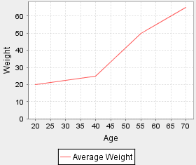
- Line graphs: A line graph is a way of representing two pieces of
information, which is usually related and vary with respect to each other. This is
useful when comparisons are needed. e.g.
- Pie Charts: A pie chart is a type of a circle graph normally used
in showcasing a wholesome quantity; we have to show that
how this whole quantity is broken into parts. The whole quantity depicts entire
sample space and the pieces of pie in the circle
graph are called sectors.

Pie chart is very useful in the analysis of business data. Developers are using pie chart to represent the business data to stakeholders.
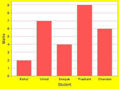
- Bar Charts: This is a type of chart, which contains labeled
horizontal or vertical bars showing a piece of information and an axis. The
numbers along the side of bar graph compose the axis. This is also called as a
histogram; Bar Graph is useful when there is a numerical comparison.
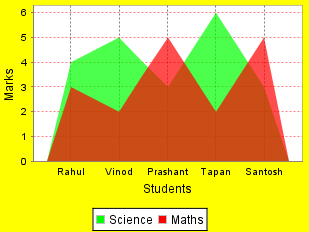
- Area Graphs: These graphs are used to show how something changes with
respect to time. An area graph shows the contribution of each data series in the
form of a picture.
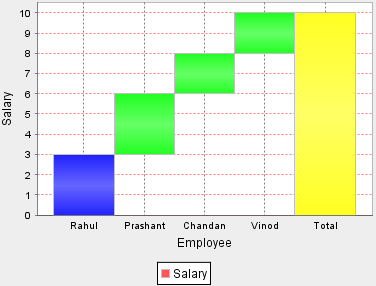
- Waterfall Chart:
This is a type of chart, which shows an increase or
decrease in a initial value. This contains floating vertical columns that shows the increase or decrease in a initial value through a series of
intermediate steps leading to a final value. An invisible column keeps the
increase or decrease related to the heights of the previous columns.
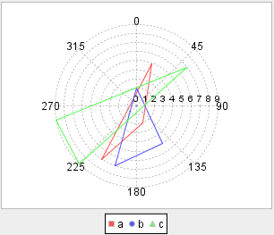
- Polar Chart: A Polar Chart is a circular chart in which data is displayed in terms of values and angles.
- This provides a mechanism to compare various qualitative and quantitative aspects of a situation graphically.
- By using Polar Charts we can plot multiple data sets each with a single line with as many points as needed.
- These are normally used in Engineering and modeling Industries.
- A Polar Chart has two variables X and Y where X is plotted as an angle and Y is the radius.
- In a Polar Chart the points are plotted in Polar coordinates rather than Cartesian coordinates.
- In a Polar Chart the dataset having the maximum values covers the maximum area in the whole graph.
-
The X and Y-axes can be used to demonstrate real world quantities.
Above article will help you in understanding the types of Charts and Graphs which can be used in the business or scientific applications.


