Creating custom application download progress bar


In the following example you will know how to create a customized application download progress bar for an application preloader. It shows the progress of downloading and initialization of the application SWF file. By default the application preloader is enabled. Preloader will be dismissed as soon as Application.creationComplete event is raised.
This download progress bar would not be displayed if the SWF file is already cached into your browser or already loaded. Flex have two kinds of download progress bar classes : SparkDownloadProgressBar and DownloadProgressBar. In the following example code we have created a customized download progress bar by extending the class DownloadProgressBar.
We can disable the download progress bar by setting the property usePreloader of the Application container to false.
| <mx:Application ................. usePreloader="false"> |
In our example we have used the easiest way of creating own download progress bar i.e by using the class DownloadProgressBar and overriding the functions of this class according to our own requirement.
CustomDowloadProgressBar.as
|
package myDownloadControl { import flash.display.DisplayObject; import flash.events.ProgressEvent; import mx.preloaders.*; public class CustomDowloadProgressBar extends DownloadProgressBar { public function CustomDowloadProgressBar() { super(); downloadingLabel="Downloading...."; initializingLabel="Initializing...."; // minimum display time is set to 5 seconds MINIMUM_DISPLAY_TIME=5000; } [Embed(source="assets/logo.jpg")] [Bindable] public var imageClass:Class; override public function get backgroundImage():Object{ return imageClass; } override public function get backgroundSize():String{ return "100%"; } override protected function showDisplayForInit(elapsedTime:int, count:int):Boolean { return true; } override protected function showDisplayForDownloading( elapsedTime:int, event:ProgressEvent):Boolean { return true; } } } |
Now this custom download progress bar class can be used within the MXML application.
CustomDownloadProgressBar.mxml
|
<?xml version="1.0" encoding="utf-8"?> <mx:Application xmlns:mx="http://www.adobe.com/2006/mxml" layout="absolute" preloader="myDownloadControl.CustomDowloadProgressBar"> <mx:Panel x="0" y="0" width="100%" height="100%" layout="absolute" title="Panel Application" borderColor="#DCA716" cornerRadius="3"> <mx:TabNavigator x="10" y="21" width="435" height="287"> <mx:Canvas label="Tab 1" width="100%" height="100%"> <mx:Form x="10" y="10" width="413" height="199"> <mx:FormItem label="First Name"> <mx:TextInput/> </mx:FormItem> <mx:FormItem label="Last Name"> <mx:TextInput/> </mx:FormItem> <mx:FormItem height="34" width="152" textAlign="left"> <mx:Button label="SUBMIT"/> </mx:FormItem> </mx:Form> </mx:Canvas> <mx:Canvas label="Tab2" width="100%" height="100%"> <mx:VideoDisplay x="10" y="10" width="287" height="161"/> <mx:HSlider x="10" y="179" width="287"/> </mx:Canvas> <mx:Canvas label="Tab 3" width="100%" height="100%"> <mx:RichTextEditor x="0" y="0" title="Write Review" height="219" width="433"> </mx:RichTextEditor> </mx:Canvas> </mx:TabNavigator> </mx:Panel> </mx:Application> |
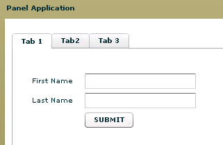
Output :
When the application initializes it would produce output like as follows:

After completion of initialization part the application will be loaded and ready to run.
You can view the source code in action as follows:
You can also download the source code from the following link as follows :