JSF selectManyCheckbox Tag
This section is to describe you selectManyCheckbox tag
of JSF. It is used to provide the user to select many items from a list of
options. The user can select one or more options. This supports two layouts "lineDirection"
and "pageDirection".layout determines whether the chenkboxes are laid
out horizontally or vertically. lineDirection is the default
layout. lineDirection sets the checkboxes in the horizontal direction of the
page and pageDirection is used to set the checkboxes in vertical direction of
the page. f:selectItem or f:selectItems are used to provide a list
of available options. selectManyCheckbox renders these options in a table
where each option is set to one cell. Each cell contains the checkbox and label
of the option. The value attribute of this tag must be value binding expression.
This value can be bound to data type of java like primitive array, object array,
List.
Code Description :
| <%@ taglib uri="http://java.sun.com/jsf/html"
prefix="h"%> <%@ taglib uri="http://java.sun.com/jsf/core" prefix="f"%> <f:view> <html> <body> <h:form> <h:outputText value="Click one or more options below :"/> <h:selectManyCheckbox id="smc" value="#{TableBean.perInfoAll}" border="1" disabled="false" title="this is 'selectManyCheckbox' demo" layout="lineDirection"> <f:selectItem id="si1" itemLabel="Thums Up" itemValue="11" /> <f:selectItem id="si2" itemLabel="Limca" itemValue="22" /> <f:selectItem id="si3" itemLabel="Pepsi" itemValue="33" /> <f:selectItem id="si4" itemLabel="Sprite" itemValue="44" /> <f:selectItem id="si5" itemLabel="Frooti" itemValue="55" /> <f:selectItem id="si6" itemLabel="Coca-Cola" itemValue="66" /> </h:selectManyCheckbox><br> </h:form> </body> </html> </f:view> |
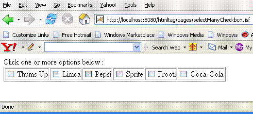
Rendered Output :
Html Source Code:
| <html> <body> <form id="_id0" method="post" action="/htmltag/pages/selectManyCheckbox.jsf" enctype="application/x-www-form-urlencoded"> Click one or more options below : <table border="1" id="_id0:smc"><tr><td> <label><input name="_id0:smc" value="11" type="checkbox" border="1" title= "this is 'selectManyCheckbox' demo"> Thums Up</input></label></td> <td> <label><input name="_id0:smc" value="22" type="checkbox" border="1" title= "this is 'selectManyCheckbox' demo"> Limca</input></label></td> <td> <label><input name="_id0:smc" value="33" type="checkbox" border="1" title= "this is 'selectManyCheckbox' demo"> Pepsi</input></label></td> <td> <label><input name="_id0:smc" value="44" type="checkbox" border="1" title= "this is 'selectManyCheckbox' demo"> Sprite</input></label></td> <td> <label><input name="_id0:smc" value="55" type="checkbox" border="1" title= "this is 'selectManyCheckbox' demo"> Frooti</input></label></td> <td> <label><input name="_id0:smc" value="66" type="checkbox" border="1" title= "this is 'selectManyCheckbox' demo"> Coca-Cola</input></label> </td> </tr> </table><br> <input type="hidden" name="_id0" value="_id0" /></form> </body> </html> |
This tag is comprised of many attributes that are summarized below :
- id : It is the component identifier that must be unique in the closest container.
- layout : This attribute is used to set the components either vertically or horizontally by two values "lineDirection" and "pageDirection" respectively.This attribute takes "lineDirection" value bydefault.
- enabledClass : This attribute is used to set the CSS class to the label of disabled choices.
- disabledClass : This attribute is used to set the CSS class to the label of enabled choices.
- binding : It takes the value binding expression that is used to link the component to the property of the backing bean.
- rendered : Its a boolean attribute. Its default value is true. It determines whether this component should be rendered or not.
- value : This is to set the current value of the component.
- converter : This specifies the converter for the component. This can be static value or EL expression .
- immediate : Its a boolean attribute. It is used to identify during which phase value change event should occur. If this attribute is set to true then in place of firing the event during the process validation phase, these event are sent immadiately at the end of apply request values phase.
- required : Its a boolean attribute. It indicates that its value is required by the user before the submission of the form to the server. If it is set to true and value is not provided then an error message comes.
- validator : It takes the method binding expression. This expression represents the validator method. This method is called at the time of validation of the component.
- valueChangeListener : This also takes a method binding expression. This expression represents value change listener method. This method will be called when new value is set for this component.
- border : It is used to set the border width of the table containing these choices.
- dir : It is used to set the direction of the text to be displayed. It can take two values LTR(left to right) and RTL (right to left).
- lang : It is used to set the base language of the component when displayed.
- style : It is used to set the CSS style definition for the component.
- title : It is the standard html attribute.It is used to set the tooltip text for this component.
- styleClass : It is used to set the CSS class for the component.
- onclick : Script to be invoked when the element is clicked.
- ondblclick : It is used for Java Script code to be invoked when the element is double-clicked.
- onmousedown : It is used for Java Script code to be invoked when the pointing device is pressed over this element.
- onmouseup : It is used for Java Script code to be invoked when the pointing device is released over this element.
- onmouseover : It is used for Java Script code to be invoked when the pointing device is moved into this element.
- onmousemove : It is used for Java Script code to be invoked when the pointing device is moved while it is in this element.
- onmouseout : It is used for Java Script code to be invoked when the pointing device is moves out of this element.
- onkeypress : It is used for Java Script code to be invoked when a key is pressed over this element.
- onkeydown : It is used for Java Script code to be invoked when a key is pressed down over this element.
- onkeyup : It is used for Java Script code to be invoked when a key is released over this element.
- accesskey : This is standard html attribute. It is used to set the access key for the element which is used to send the focus to the element when pressed.
- alt : This is used as an alternate text that is displayed when browser is not able to display the element.
- disabled : Its a boolean attribute. This is used to disable the element to receive focus, when it is set to true.
- onblur : It is used to set the java script code to execute when focus is lost from the element.
- onfocus : It is used to set the java script code to execute when focus is received by the element.
- onchange : It is used to set the java script code to execute when element is modified.
- onselect : It is used to set the java script code to execute when element is modified
- readonly : Its a boolean attribute. It is used to indicate the user that its value can't be modified, if it is set to true.
- tabindex : This is a standard html attribute. It is used to set the order of receiving the focus on the movement of TAB key by the user.