
JSF panelGrid Tag
This tag is used create compound component that
is used to layout other components. This tag renders html table with
specified no. of columns. Children of this element are rendered in
cells of the columns of the table. This tag helps to construct the table
which can automatically arrange the elements in cells of the table of
specified columns. Suppose, we have specified no. of columns to 3 and we
have taken 5 elements then these elements will get automatically
arranged in two rows (3 elements in 3 columns consecutively in the
the first row and other 2 in the second row in the same manner. So last
two elements will be visible in two columns and third will be blank. For
more stylish and customized appearance CSS can be used. By default the
no. of columns is "1". The no of rows is decided by the no. of
elements to display in the specified no. of columns.
Code Description :
<%@ taglib uri="http://java.sun.com/jsf/html" prefix="h"%>
|
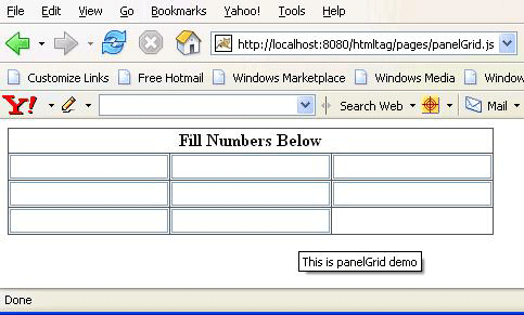
Rendered Output :
Html Source Code:
<html>
|
This tag is comprised of many attributes that are summarized below :
- id : It is the component identifier that must be unique in the closest container.
- binding : It takes the value binding expression that is used to link the component to the property of the backing bean.
- rendered : Its a boolean attribute. Its default value is true. It determines whether this component should be rendered or not.
- columns : This is used to specify the no. of columns in the grid.
- border : This is used to set the width of the border.
- bgcolor : This is used to set the background color of the table.
- cellpadding : This is used to set the space between the content and the border of the cell.
- cellspacing : This is used to set the space between the cells of the table.
- frame : This is used to specify the part of the frame, surrounding the table, will be visible.
- rules : This specifies which line between the
cells will be appear in the table. It can take some values :
1) none no rules (This is the default value.)
2) groups between row groups
3) rows between rows only
4) cols between columns only
5) all between rows and columns - summary : This can be used to provide the summary of the table.
- width : This can be used to specify the width of the table either in pixel or percentage.
- columnClasses : This is used to specify the comma seperated list of CSS style classes to be applied on the columns of the table.
- headerClass : This is used to specify the spaces seperated list of CSS style classes to be applied on the header of the table.
- footerClass : This is used to specify the spaces seperated list of CSS style classes to be applied on the footer of the table.
- rowClasses : This is used to specify the comma seperated list of CSS style classes to be applied on the rows of the table.
- dir : It is used to set the direction of the text to be displayed. It can take two values LTR(left to right) and RTL (right to left).
- lang : It is used to set the base language of the component when displayed.
- style : It is used to set the CSS style definition for the component.
- title : It is the standard html attribute.It is used to set the tooltip text for this component.
- styleClass : It is used to set the CSS class for the component.
- onclick : Script to be invoked when the element is clicked.
- ondblclick : It is used for Java Script code to be invoked when the element is double-clicked.
- onmousedown : It is used for Java Script code to be invoked when the pointing device is pressed over this element.
- onmouseup : It is used for Java Script code to be invoked when the pointing device is released over this element.
- onmouseover : It is used for Java Script code to be invoked when the pointing device is moved into this element.
- onmousemove : It is used for Java Script code to be invoked when the pointing device is moved while it is in this element.
- onmouseout : It is used for Java Script code to be invoked when the pointing device is moves out of this element.
- onkeypress : It is used for Java Script code to be invoked when a key is pressed over this element.
- onkeydown : It is used for Java Script code to be invoked when a key is pressed down over this element.
- onkeyup : It is used for Java Script code to be invoked when a key is released over this element.