
Tomahawk panelGroup tag
This is used to create a component that acts as a container to group a set of components. All these components are under one component or can say one parent. So this can be useful when we want to nest two or more components into one parent panelGrid column. If we want to render two components without using this tag then these will be rendered in separate columns. This component renders its all children and count them as one component. So this fact of this tag can be useful for us in the case where a component allows only one child component. The program given below will make you clear this concept.
Code Description :
<%@ taglib uri="http://java.sun.com/jsf/html" prefix="h"%>
<%@ taglib uri="http://java.sun.com/jsf/core" prefix="f"%>
<%@ taglib uri="http://myfaces.apache.org/tomahawk" prefix="t"%>
<html>
<head>
<meta http-equiv="Content-Type" content="text/html; charset=iso-8859-1">
<title>t:panelGroup example</title>
<style type="text/css">
<!--
body{
margin-top:30;
}
.highlight {background-color: #A8D1E8; color:#000000;}
.TableRow1 {
background-color: #D0E6E0;
}
.TableRow2 {
background-color: #E8F7F1;
}
.TableColumn {
text-align: center
}
.TableClass {
font-family : verdana, Geneva, Arial, Helvetica, sans-serif;
font-size: 13px;
color: #000000;
padding: 2;
border-style: solid;
border-width: 2px;
}
.TableHeader {
color: #000000;
background-color: #F1F1F1;
padding: 3;
text-align: center;
border: none;
}
.TableFooter {
background-color: #F1F1F1;
}
-->
</style>
</head>
<body ><center>
<f:view>
<h:form id="form1" >
<t:panelGrid id="dt1" columns="2" border="10" cellpadding="5"
cellspacing="3" dir="LTR" frame="hsides" rules="all" >
<f:facet name="header">
<h:outputText value="Customer Profile" />
</f:facet>
<t:panelGroup colspan="2">
<t:panelGrid columns="2" width="100%" style="color:green;" >
<f:facet name="header">
<h:outputText value="Personal Information"
style="color:#006699;"/>
</f:facet>
<t:outputText value="Name"></t:outputText>
<t:inputText />
<t:outputText value="Contact Number"
onmouseover="this.className='highlight1'"
onmouseout="this.className='normal'">
</t:outputText>
<t:inputText />
</t:panelGrid>
</t:panelGroup>
<t:panelGroup >
<t:panelGrid columns="2" width="100%" style="color:green;">
<f:facet name="header">
<h:outputText value="Educational Information"
style="color:#006699;"/>
</f:facet>
<t:outputText value="Certificate Name" ></t:outputText>
<t:inputText />
<t:outputText value="Year"></t:outputText>
<t:inputText />
</t:panelGrid>
</t:panelGroup>
<t:panelGroup>
<t:panelGrid columns="4" width="100%" style="color:green;">
<f:facet name="header">
<h:outputText value="Achievements & Awards"
style="color:#006699;"/>
</f:facet>
<t:outputText value="Name"></t:outputText>
<t:inputText />
<t:outputText value="Year"></t:outputText>
<t:inputText />
<t:outputText value="Name"></t:outputText>
<t:inputText />
<t:outputText value="Year"></t:outputText>
<t:inputText />
</t:panelGrid>
</t:panelGroup>
<t:panelGroup colspan="2" style="color:#006699;
font-weight:bold" onmouseover="this.className=
'highlight'" onmouseout="this.className='normal'">
<t:outputText value="Additional Informtion" >
</t:outputText>
<f:verbatim></br></f:verbatim>
<t:inputTextarea rows="2" cols="60" />
<f:verbatim></br></f:verbatim>
<t:outputText value="* If you want to add any extra
information, describe those in the above area." >
</t:outputText>
</t:panelGroup>
<f:facet name="footer">
<h:outputText value="** Your information will be kept
secret." />
</f:facet>
</t:panelGrid><br><br>
</h:form>
</f:view>
</center></body>
</html>
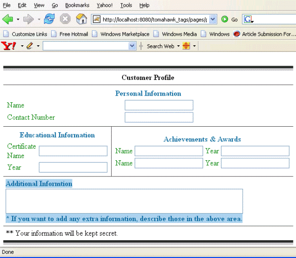
Rendered Output :
Html Source Code :
<html>
<head>
<meta http-equiv="Content-Type" content="text/html; charset=iso-8859-1">
<title>t:panelGrid example</title>
<style type="text/css">
<!--
body{
margin-top:30;
}
.highlight {background-color: #A8D1E8; color:#000000;}
.TableRow1 {
background-color: #D0E6E0;
}
.TableRow2 {
background-color: #E8F7F1;
}
.TableColumn {
text-align: center
}
.TableClass {
font-family : verdana, Geneva, Arial, Helvetica, sans-serif;
font-size: 13px;
color: #000000;
padding: 2;
border-style: solid;
border-width: 2px;
}
.TableHeader {
color: #000000;
background-color: #F1F1F1;
padding: 3;
text-align: center;
border: none;
}
.TableFooter {
background-color: #F1F1F1;
}
-->
</style>
</head>
<body ><center>
<form id="form1" name="form1" method="post"
action="/tomahawk_tags/pages/panelGroup.jsf"
enctype="application/x-www-form-urlencoded">
<table id="form1:dt1" border="10" cellpadding="5"
cellspacing="3" frame="hsides" rules="all" dir="LTR">
<thead><tr><th scope="colgroup" colspan="2">
Customer Profile
</th></tr></thead>
<tfoot><tr><td colspan="2">
** Your information will be kept secret.
</td></tr></tfoot><tbody><tr><td colspan="2"><table
width="100%" style="color:green;">
<thead><tr><th scope="colgroup" colspan="2">
<span style="color:#006699;">Personal Information</span>
</th></tr></thead><tbody><tr><td>Name</td><td><input
id="form1:_idJsp5" name="form1:_idJsp5" type="text"
value="" /></td></tr>
<tr><td><span onmouseover="this.className='highlight1'"
onmouseout="this.className='normal'">Contact Number</span></td>
<td><input id="form1:_idJsp7" name="form1:_idJsp7" type="text"
value="" /></td></tr>
</tbody></table></td></tr>
<tr><td><table width="100%" style="color:green;">
<thead><tr><th scope="colgroup" colspan="2">
<span style="color:#006699;">Educational Information</span>
</th></tr></thead><tbody><tr><td>Certificate Name</td><td>
<input id="form1:_idJsp12" name="form1:_idJsp12" type="text"
value="" /></td></tr>
<tr><td>Year</td><td><input id="form1:_idJsp14"
name="form1:_idJsp14" type="text" value="" /></td></tr>
</tbody></table></td><td><table width="100%"
style="color:green;">
<thead><tr><th scope="colgroup" colspan="4">
<span style="color:#006699;">Achievements & Awards</span>
</th></tr></thead><tbody><tr><td>Name</td><td><input
id="form1:_idJsp19" name="form1:_idJsp19" type="text" value="" />
</td><td>Year</td><td><input id="form1:_idJsp21"
name="form1:_idJsp21" type="text" value="" /></td></tr>
<tr><td>Name</td><td><input id="form1:_idJsp23"
name="form1:_idJsp23" type="text" value="" /></td><td>Year</td>
<td><input id="form1:_idJsp25" name="form1:_idJsp25" type="text"
value="" /></td></tr>
</tbody></table></td></tr>
<tr><td colspan="2"><span onmouseover="this.className='highlight'"
onmouseout="this.className='normal'"
style="color:#006699;font-weight:bold">Additional Informtion</br>
<textarea name="form1:_idJsp29" cols="60" rows="2"></textarea></br>
* If you want to add any extra information, describe those
in the above area.</span></td></tr>
</tbody></table><br><br>
<input type="hidden" name="form1_SUBMIT" value="1" />
<input type="hidden" name="javax.faces.ViewState"
id="javax.faces.ViewState" value="rO0ABXVyABNbTGphdmEubGFuZy5PYmp
lY3Q7kM5YnxBzKWwCAAB4cAAAAAN0AAEzcHQAFS9wYWdlcy9wYW5lbEd
yb3VwLmpzcA==" /></form>
</center><!-- MYFACES JAVASCRIPT -->
</body>
</html>
This tag contains attributes given below :
- id : This is the value which is used to uniquely identify the component within the closest container like form or subview. The main thing to remember is that its value must be a static value.
- binding : This attribute is used to specify the property of the backing bean with which this component instance is to be bound.
- rendered : Its default value is true. If this attribute is set to true then this component is presented in the page to the user. If false, then this component is not rendered.
- dir : It is used to set the direction of the text to be displayed. It can take two values LTR(left to right) and RTL (right to left).
- lang : It is used to set the base language of the component when displayed.
- style : It is used to set the CSS style definition for the component.
- title : It is the standard html attribute. It is used to set the tooltip text for this component.
- styleClass : It is used to set the CSS class for the component. It is same as html class attribute.
- onclick : Script to be invoked when the element is clicked.
- ondblclick : It is used for Java Script code to be invoked when the element is double-clicked.
- onmousedown : It is used for Java Script code to be invoked when the pointing device is pressed over this element.
- onmouseup : It is used for Java Script code to be invoked when the pointing device is released over this element.
- onmouseover : It is used for Java Script code to be invoked when the pointing device is moved into this element.
- onmousemove : It is used for Java Script code to be invoked when the pointing device is moved while it is in this element.
- onmouseout : It is used for Java Script code to be invoked when the pointing device is moved out of this element.
- onkeypress : It is used for Java Script code to be invoked when a key is pressed over this element.
- onkeydown : It is used for Java Script code to be invoked when a key is pressed down over this element.
- onkeyup : It is used for Java Script code to be invoked when a key is released over this element.
- enabledOnUserRole :If the current user has one of the roles listed in the enabledOnUserRole attribute then enabling or disabling of the component is decided on the base of "disabled" attribute. If disabled attribute is set to true then component is disabled otherwise enabled. If the user is not in the above list then the component is rendered disabled.
- visibleOnUserRole :If the current user has one of the roles listed in the visibleOnUserRole attribute then processing of the component is decided on the base of "rendered" attribute. If the rendered attribute is set to true then component is not rendered otherwise displayed on the page. On the other hand if the current user is not in the above list then the component is not processed.
- forceId : This is a boolean attribute with default value false. If this attribute is set to true, the tag is forced to render the id for the component exactly as mentioned in the id attribute of the tag. The benefit of this attribute is that we can reference component by id in the javascript. If we don't use this attribute with the true value then the id for the component is presented in different format.
- forceIdIndex : This is a boolean attribute with default value true. If this value is true then the the component displays the index number in its id value if the component is in a list. If this attribute is set to false then this component will not append index number as suffix . If forcrId is set to false then its value is ignored.
- displayValueOnly : This is boolean attribute with the default value false. If this value is set to true then only the value of the component is rendered not the widget of the component.
- displayValueOnlyStyle : This attribute is used to specify the style used when displayValueOnly is true.
- displayValueOnlyStyleClass : This attribute is used to specify the style class used when displayValueOnly is true.
- layout : This attribute is used to specify the layout used when rendering the panelGroup.
- colspan : This is the standard html colspan attribute for table cell.