Slider in Flex4
Flex4 Slider control is also called a Spark Slider control. You can select a value by moving a slider thumb between two end points of the Slider track. There are two types of Slider control.
Flex4 Slider control is also called a Spark Slider control. You can select a value by moving a slider thumb between two end points of the Slider track. There are two types of Slider control.Slider control in Flex4:
Flex4 Slider control is also called a Spark Slider control. You can select a value
by moving a slider thumb between two end points of the Slider track. There are
two types of Slider control. First is VSlider control and second is HSlider
control which
are used for vertical and horizontal sliding. When we click a
slider thumb a data tip appears which show the current value of the Slider
control. You can show the current value of the slider by using the showDataTip
property. By default the minimum value is 0 and maximum value of the Slider control is 100
respectively. The current value depends on the minimum and maximum value of the
control. The tag of VSlider and HSlider control are <s:VSlider>,
<s:HSlider> respectively.
Example:
|
<?xml version="1.0" encoding="utf-8"?> <s:Application xmlns:fx="http://ns.adobe.com/mxml/2009"xmlns:s=" library://ns.adobe.com/flex/spark"xmlns:mx=" library://ns.adobe.com/flex/mx"><s:Panel title="Slider control Example" height="224" width="344"></s:Application> |
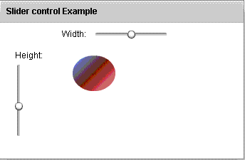
In this example you can see how we can use a Slider control in Flex4.
Output:
Running Application:
To view this page ensure that Adobe Flash Player version 10.0.0 or greater is installed.
