ToggleButtonBar Control in Flex4
The ButtonBar control and the ToggleButtonBar control both are same. The ToggleButtonBar control is a MX component.
The ButtonBar control and the ToggleButtonBar control both are same. The ToggleButtonBar control is a MX component.ToggleButtonBar control in Flex4:
The ButtonBar control and the ToggleButtonBar control both are same. The
ToggleButtonBar control is a MX component. It has no Spark component. You can
Set buttons in horizontal and vertical layout. This control defines only single
event itemClick event. In ToggleButtonBar control all buttons are in a group and
maintain their state. Only one button will be in selected state at a time and
left buttons will be in deselected state at that time.
The tag of this control is <mx:ToggleButtonBar>.
Example:
|
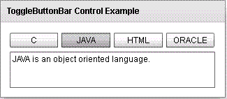
<?xml version="1.0" encoding="utf-8"?> <s:Application xmlns:fx="http://ns.adobe.com/mxml/2009"xmlns:s=" library://ns.adobe.com/flex/spark"xmlns:mx=" library://ns.adobe.com/flex/mx"minWidth=" 955" minHeight="600"><fx:Script> <![CDATA[ public function clickHandler(event:Event):void{ if(tobuttbar.selectedIndex==0){ txt.text="C is a middle level language."; } if(tobuttbar.selectedIndex==1){ txt.text="JAVA is an object oriented language."; } if(tobuttbar.selectedIndex==2){ txt.text="HTML is used for designing a web page."; } if(tobuttbar.selectedIndex==3){ txt.text="ORACLE is a database."; } } ]]> </fx:Script> <s:Panel title="ToggleButtonBar Control Example" height="140" width="323"> <s:VGroup x="13" y="15"> <mx:ToggleButtonBar id="tobuttbar" horizontalGap="5" itemClick="clickHandler(event);" toggleOnClick="true"> <mx:dataProvider> <fx:String>C</fx:String> <fx:String>JAVA</fx:String> <fx:String>HTML</fx:String> <fx:String>ORACLE</fx:String> </mx:dataProvider> </mx:ToggleButtonBar> <s:TextArea id="txt" width="294" height="52"/> </s:VGroup> </s:Panel> </s:Application> |
In this example you can see how we can use a ToggleButtonBar control in Flex4.
Output:
Running Application:
To view this page ensure that Adobe Flash Player version 10.0.0 or greater is installed.
