TileList Control in Flex4
The TileList control displays a component in tile form vertically. The item will be displayed in vertical columns or horizontal rows.
The TileList control displays a component in tile form vertically. The item will be displayed in vertical columns or horizontal rows.TileList control in Flex4:
The TileList control displays a component in tile form
vertically. The item will be displayed in vertical columns or horizontal rows.
The Canvas layout Container is a MX component. There is no spark component. You
can display a list of items and images in it. The items will be displayed from
top to bottom. It looks like a VBox control and Tile Container. But it can be
better than a Tile container. You can set the maxcolumn property value for
showing a item. It contains a vertical scrollbar.
The tag of Tilelist control is <mx:TileList>.
Example:
|
<?xml version="1.0" encoding="utf-8"?> <s:Application xmlns:fx="http://ns.adobe.com/mxml/2009"xmlns:s=" library://ns.adobe.com/flex/spark"xmlns:mx=" library://ns.adobe.com/flex/mx"minWidth=" 955" minHeight="600">maxColumns=" 2"width=" 235" height="193"> <mx:dataProvider> <fx:Array></s:Application> |
Output:
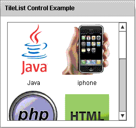
Running Application:
To view this page ensure that Adobe Flash Player version 10.0.0 or greater is installed.
