Returning data from an MX item editor in Flex4
The ItemEditor control is a MX component. It has no spark component. The ItemEditor control is used for return a single value to the control.
The ItemEditor control is a MX component. It has no spark component. The ItemEditor control is used for return a single value to the control.Returning Data from an MX itemEditor in Flex4:
The ItemEditor control is a MX component. It has no spark component. The ItemEditor control is used for return a single value to the control. You will use the editorDataField property in the appropriate column for showing a new value in the column field. The default value of the editorDataField property is "text" and the item editor is a TextInput control. The tag of item editor is <mx:itemEditor>.
In this example you will see how we can change the value of the field in data grid contol.
Example:
|
<?xml version="1.0" encoding="utf-8"?> <s:Application xmlns:fx="http://ns.adobe.com/mxml/2009"xmlns:s=" library://ns.adobe.com/flex/spark"xmlns:mx=" library://ns.adobe.com/flex/mx"minWidth=" 955" minHeight="600"> <fx:Script><![CDATA[ [ Bindable] private var compdata:ArrayCollection = new ArrayCollection([{Product: "Monitor", Quantity:0, Price:7000, Available:false},{Product: "Keyboard", Quantity:4, Price:1000, Available:true},{Product: "Mouse", Quantity:2, Price:300, Available:true},]); ]]> </fx:Script>dataProvider=" {compdata}"variableRowHeight=" true"editable=" true" x="12" y="12"> <mx:columns>headerText=" Quantity"itemEditor=" mx.controls.NumericStepper"editorDataField=" value"/> <mx:DataGridColumn dataField="Price" headerText="Price"/>headerText=" Available"editorDataField=" avail"><![CDATA[ [ Bindable] public var avail:Boolean;]]> label=" Availability"height=" 100%" width="100%"selected=" {data.Available}"click="avail=chk.selected" /></s:Application> |
Output:
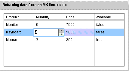
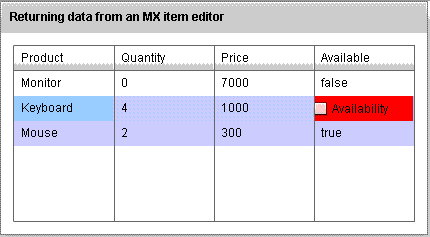
Running Application:
To view this page ensure that Adobe Flash Player version 10.0.0 or greater is installed.
