ProgressBar Control in Flex4
The ProgressBar Control is a MX component. It has no Spark Component.
The ProgressBar Control is a MX component. It has no Spark Component.ProgressBar control in Flex4:
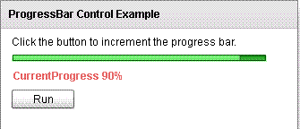
The ProgressBar Control is a MX component. It has no Spark Component. The ProgressBar Control displays a loading progress of task over time. The user can use this when you wait for a limited time of period. The progress line of Progress Control represent time-based processes. There are three types of modes: event, polled, manual. The tag of ProgressBar control is <mx:ProgressBar>.
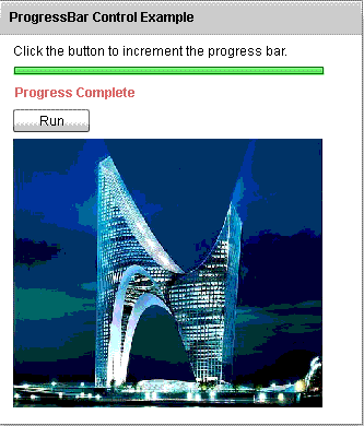
In this example when you click on run button the ProgressBar will progress and when the progress will be completed(100%) then shows a image.
Example:
|
<?xml version="1.0" encoding="utf-8"?> <s:Application xmlns:fx="http://ns.adobe.com/mxml/2009"xmlns:s=" library://ns.adobe.com/flex/spark"xmlns:mx=" library://ns.adobe.com/flex/mx"minWidth=" 955" minHeight="600"> <fx:Script><![CDATA[ { if(j<=100){{ bar.setProgress(j,100); bar.label= "CurrentProgress" + " " + j + "%";j+=10; } if(j>100){image.load( '/tutorialfiles/1229.building1.jpg');bar.label= "Progress Complete";j!=0; } } ]]> </fx:Script>width=" 285"source=" image"label=" Loading..."labelWidth=" 400"chromeColor=" #4EC44E"color=" #E26060"mode=" manual"direction=" right"/>label=" Run"click="run();" />height=" 246" width="305"autoLoad=" false"visible=" true"/> </s:VGroup> </s:Panel></s:Application> |
Output:/h3>
Running Application:
To view this page ensure that Adobe Flash Player version 10.0.0 or greater is installed.
