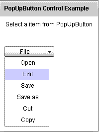
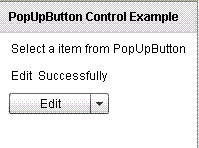
PopUpButton Control in Flex4
The PopUpButton control is a MX component. It has no Spark component. It contains a two horizontal button: main button and a small button or pop-up button.
The PopUpButton control is a MX component. It has no Spark component. It contains a two horizontal button: main button and a small button or pop-up button.PopUpButton control in Flex4:
The PopUpButton control is a MX component. It has no
Spark component.
It contains a two horizontal button: main button and a small button or pop-up
button. Pop-up button has a icon and main button is a button control. When the
user clicked a small button then opens a second pop-up control. If you click
outside the pop-up control the pop-up will be closed. You can use the menu
control as a pop-up control. It is not necessary that you can use a menu control
as a pop-up control. You can change the label of the button using change
function. You can use any component as a pop-up control. The tag of this control
is <mx:PopUpButton>.
Example:
|
<?xml version="1.0" encoding="utf-8"?> <s:Application xmlns:fx="http://ns.adobe.com/mxml/2009"xmlns:s=" library://ns.adobe.com/flex/spark"xmlns:mx=" library://ns.adobe.com/flex/mx"minWidth=" 955" minHeight="600"><![CDATA[ import mx.controls.*;menu1 = new Menu(); var data:Object = [{label: "Open"},{label: "Edit"},{label: "Save"},{label: "Save as"},{label: "Cut"},{label: "Copy"}]; menu1.dataProvider = data; menu1.addEventListener( "itemClick", changeHandler);pbtn.popUp = menu1; } private function changeHandler(event:MenuEvent):void { var label:String = event.label;pbtn.label = label; lbl.text= label + " " + "Successfully";} ]]> </fx:Script> <s:Panel title="PopUpButton Control Example" width="199" height="263"/>label=" File"width=" 100"creationComplete="menuinit();" /> </s:VGroup></s:Application> |
In this example you can see how we can use a PopUpButton control in Flex4.
Output:
Running Application:
To view this page ensure that Adobe Flash Player version 10.0.0 or greater is installed.
