PopUpAnchor Control in Flex4
The PopUpAnchor control is a Spark component. This new component added in Flex4. The PopUpAnchor control is used to a pop-up component in a layout.
The PopUpAnchor control is a Spark component. This new component added in Flex4. The PopUpAnchor control is used to a pop-up component in a layout.PopUpAnchor Control in Flex4:
The PopUpAnchor control is a Spark component. This new
component added in Flex4. The PopUpAnchor control is used to a pop-up component
in a layout. The pop-up component has no visual appearance. The PopUpAnchor
shows the pop-up component when we add it to the PopUpManager. You can use the
PopUpAncher control for different uses like click a button and a login form pop
ups, click a hyperlink and a message pop ups.
The tag of PopUpAncher control is <s:PopUpAnchor>.
Example:
|
<?xml version="1.0" encoding="utf-8"?> <s:Application xmlns:fx="http://ns.adobe.com/mxml/2009"xmlns:s=" library://ns.adobe.com/flex/spark"xmlns:mx=" library://ns.adobe.com/flex/mx" > <fx:Style>{ borderStyle : "solid";} .but{} duration=" 300"/> </mx:Sequence> </mx:Transition>width.loginOpen=" 274"height.loginOpen=" 172"width.normal=" 199"height.normal=" 65"title.loginOpen=" PopUpAnchor Control Example"title.normal=" PopUpAnchor Control Example"> <s:Group>click="currentState = 'loginOpen'"visible.loginOpen=" false"chromeColor=" #000000"color=" #ffffff"/> <s:PopUpAnchor id="loginPopUp"left=" 0" bottom="0"popUpPosition=" below"includeIn=" loginOpen"displayPopUp.normal=" false"displayPopUp.loginOpen=" true"> <s:BorderContainer cornerRadius="20"styleName=" loginform&q"backgroundImage=" @Embed
(source='file:/C:/work/bikrant/flex4component/popupancher/2.jpg')"> fontStyle="italic" color="#000000"/> </FormItem> <mx:FormItem direction="horizontal">click="currentState = 'normal'" styleName="but"/> <s:Button label="Cancel"click="currentState = 'normal'" styleName="but"/> </mx:FormItem> </mx:Form>text=" USER LOGIN"horizontalCenter.normal=" 2"x.loginOpen=" 99" y.loginOpen="5"visible.normal=" false" fontWeight="bold"text.loginOpen=" USER LOGIN"/><</s:Application> |
In this example you can see how we can use a PopUpAnchor control in Flex4.
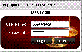
Output:
In this example you can see how the pop up component dispayed. click a button and pop ups a login form.

Running Application:
To view this page ensure that Adobe Flash Player version 10.0.0 or greater is installed.
