HScrollBar in Flex4
The HScrollBar controls is used both in the MX and Spark's component. The HScrollBar control can work as a stand-alone controls, it works combinedly with other compentents as a custom component to provide scrolling functionality.
The HScrollBar controls is used both in the MX and Spark's component. The HScrollBar control can work as a stand-alone controls, it works combinedly with other compentents as a custom component to provide scrolling functionality.HScrollBar in Flex4:
The HScrollBar controls is used both in the MX and Spark's component. The HScrollBar control can work as a stand-alone controls, it works combinedly with other compentents as a custom component to provide scrolling functionality. It has four parts: a track, two arrow buttons, and a thumb. The width of this control is equal to the largest width of its subcomponents. The tag of HScrollbar is <s:HScrollbar>.
Example:
|
<?xml version="1.0" encoding="utf-8"?> <s:Application xmlns:fx="http://ns.adobe.com/mxml/2009"xmlns:mx=" library://ns.adobe.com/flex/mx"xmlns:s=" library://ns.adobe.com/flex/spark"> <s:Panel title="HScrollbar Example" width="281" height="122">clipAndEnableScrolling=" true"itemRenderer=" spark.skins.spark.DefaultItemRenderer"> <s:layout></s:Application> |
In this example you can see how we can use a HScrollBar control in Flex4.
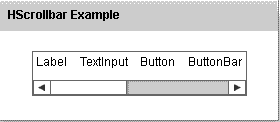
Output:
Running Application:
To view this page ensure that Adobe Flash Player version 10.0.0 or greater is installed.
