ColorPicker in Flex4
The ColorPicker control is a MX component not a Spark component. When you can choose a color from it the swatch panel expands upward the application and after the selection of a color the swatch panel will be closed.
The ColorPicker control is a MX component not a Spark component. When you can choose a color from it the swatch panel expands upward the application and after the selection of a color the swatch panel will be closed.ColorPicker control in Flex4:
The ColorPicker control is a MX component not a Spark
component. When you can choose a color from it the swatch panel expands
upward the application and after the selection of a color the swatch panel will
be closed.
If you set the showTextField property is true then a text box with label will be
shown for a selected color.
The tag of ColorPicker is <mx:ColorPicker>.
Example:
|
<?xml version="1.0" encoding="utf-8"?> <s:Application xmlns:fx="http://ns.adobe.com/mxml/2009"xmlns:s=" library://ns.adobe.com/flex/spark"xmlns:mx=" library://ns.adobe.com/flex/mx"> <s:Panel title="ColorPicker control Example" width="295" height="202">height="88" width="257"> </s:SkinnableContainer> </s:Application> |
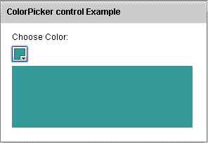
In this example you can see how we can use a ColorPicker control in Flex4.
Output:
Running Application:
To view this page ensure that Adobe Flash Player version 10.0.0 or greater is installed.
